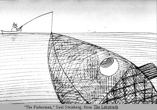
Balance is the equal distribution of visual weight in a design. Visual balance occurs around a vertical axis; our eyes require the visual weight to be equal on the two sides of the axis. We are bilateral creatures and our sense of balance is innate. When elements are not balanced around a vertical axis, the effect is disturbing and makes us uncomfortable .
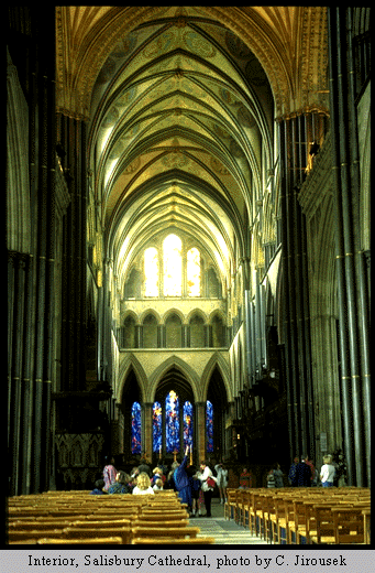
 Symmetrical, or formal balance, is also known as bilateral symmetry. It is created by repeating the reverse of a design on the opposite side of the vertical axis; each side, in essence, becomes the mirror image of the other. Symmetrical balance is considered formal, ordered, stable and quiet. It can also be boring. Symmetrical balance is often used in architecture.
 While symmetry achieves balance through repetition, asymmetry achieves balance through contrast. Asymmetrical, or informal balance, involves different elements that have equal visual weight; the weight is equal but the elements are not identical.
Visual weight is influenced by:
- Position - the further out an element is from the center, the heavier it will feel; a large object placed near the center can be balanced by a smaller object placed near the edge
- Size - larger feels heavier
- Texture - an element with more complex texture is heavier visually than one with a simple texture or no texture at all
- Isolation - an isolated element has more visual weight
- Value - darker feels heavier
- Value contrast - the higher the value-contrast, the heavier the weight
- Quantity - multiple small objects can balance one larger object
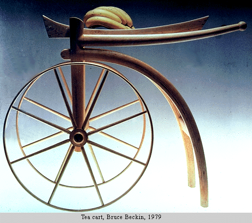
- Orientation - a diagonal orientation carries more visual weight than a horizontal or vertical one
- Shape - elements that have more complex shapes feel heavier than those with simple shapes
- Color - the brighter and more intense its color, the heavier the element will feel
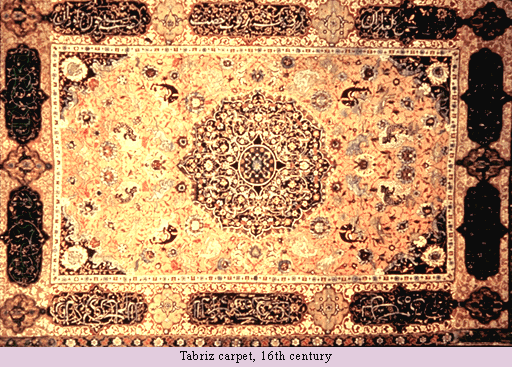
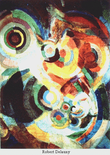
 Radial balance occurs when all the elements radiate out from a central point and the visual weight is distributed equally. Radial balance creates a strong focal point in the center of the design. Clock faces and daisies are examples of radial balance.
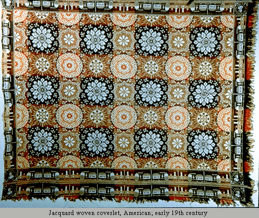
 Crystallographic balance, or an allover pattern, is created by repeating elements of equal weight everywhere. Emphasis is uniform; there is no distinct focal point. Quilts and chessboards are examples of crystallographic balance.
Proportion
Proportion refers to the relative size and scale of the various elements in a design. The issue is the relationship between objects, or parts, of a whole. This means that it is necessary to discuss proportion in terms of the context or standard used to determine proportions.
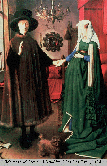
 Our most universal standard of measurement is the human body; that is, our experience of living in our own bodies. We judge the appropriateness of size of objects by that measure. For example, a sofa in the form of a hand is startling because of the distortion of expected proportion, and becomes the center of attention in the room. Architectural spaces intended to impress are usually scaled to a size that dwarfs the human viewer. This is a device often used in public spaces, such as churches or centers of government. The same principle is often applied to corporate spaces through which the enterprise wishes to impress customers with its power and invincibility.
In contrast, the proportions of a private home are usually more in scale with human measure, and as a result it appears more friendly, comfortable, less intimidating.

Use of appropriate scale in surface design is also important. For example, an overly large textile design can overwhelm the form of a garment or a piece of furniture.
A surprising aspect of proportion is the way ideal proportions can vary for the human body itself. Styles change in bodies as they do in clothing. Prior to the 16th century, for example, the female body ideally had large hips and belly. Only later was a small waistline stressed.
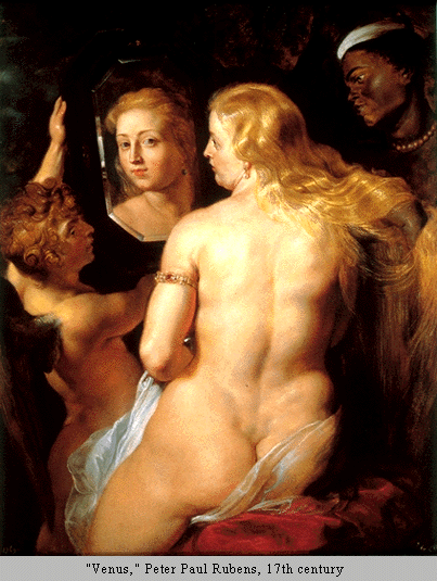
In the 17th century and many other periods, the ideal body was much heavier than we would accept today.
Of course, in the last 35 years the ideal personified by the fashion model has fostered a standard which idealizes exceptionally slender body proportions for women. In this century, sports have provided models for ideal male body proportions. Beginning with the rise of televised football in the 1960's, and the subsequent fitness boom, an increasingly exaggerated muscular silhouette, corresponding to that of the uniformed and padded football player, was presented as the ultimate male form. Only in this period could Arnold Schwartzenegger have represented the heroic ideal body image. This trend reached its most extreme form in the late 1970s and early 1980s. Since that time the emergence of basketball as the predominant American sport has led to a more naturally proportioned fit body ideal for men.
Rhythm
Rhythm can be described as timed movement through space; an easy, connected path along which the eye follows a regular arrangement of motifs. The presence of rhythm creates predictability and order in a composition. Visual rhythm may be best understood by relating it to rhythm in sound. This link will take you to a video clip and explanation of how the sound of a Nigerian "talking drum" follows the intonation and rhythm of speech.Rhythm depends largely upon the elements of pattern and movement to achieve its effects. The parallels between rhythm in sound/ music are very exact to the idea of rhythm in a visual composition. The difference is that the timed "beat" is sensed by the eyes rather than the ears.Visual rhythm can be created in a number of ways. Linear rhythm refers to the characteristic flow of the individual line. Accomplished artists have a recognizable manner of putting down the lines of their drawings that is a direct result of the characteristic gesture used to make those lines, which, if observed, can be seen to have a rhythm of its own. Linear rhythm is not as dependent on pattern, but is more dependent on timed movement of the viewer's eye.
Repetition involves the use of patterning to achieve timed movement and a visual "beat". This repetition may be a clear repetition of elements in a composition, or it may be a more subtle kind of repetition that can be observed in the underlying structure of the image.
Alternation is a specific instance of patterning in which a sequence of repeating motifs are presented in turn; (short/long; fat/thin; round/square; dark/light).
Gradation employs a series of motifs patterned to relate to one another through a regular progression of steps. This may be a gradation of shape or color. Some shape gradations may in fact create a sequence of events, not unlike a series of images in a comic strip.
Emphasis
Emphasis is also referred to as point of focus, or interruption. It marks the locations in a composition which most strongly draw the viewers attention. Usually there is a primary, or main, point of emphasis, with perhaps secondary emphases in other parts of the composition. The emphasis is usually an interruption in the fundamental pattern or movement of the viewers eye through the composition, or a break in the rhythm.The artist or designer uses emphasis to call attention to something, or to vary the composition in order to hold the viewers interest by providing visual "surprises."

Emphasis can be achieved in a number of ways. Repetition creates emphasis by calling attention to the repeated element through sheer force of numbers. If a color is repeated across a map, the places where certain colors cluster will attract your attention, in this instance graphing varying rates of mortality from cardiovascular disease.

Contrast achieves emphasis by setting the point of emphasis apart from the rest of its background. Various kinds of contrasts are possible. The use of a neutral background isolates the point of emphasis.
Contrast of color, texture, or shape will call attention to a specific point.
Contrast of size or scale will as well.

Placement in a strategic position will call attention to a particular element of a design.
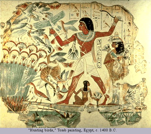
Prolonged visual involvement through intricacy (contrast of detail) is a more unusual form of emphasis, not as commonly used in Euro-American design, though it is common in many other cultures. In this case, many points of emphasis are created that are to be discovered through close attention to the intricacies of the design.
Unity
Unity is the underlying principle that summarizes all of the principles and elements of design. It refers to the coherence of the whole, the sense that all of the parts are working together to achieve a common result; a harmony of all the parts.
Unity can be achieved through the effective and consistent use of any of the elements, but pattern-- that is, underlying structure-- is the most fundamental element for a strong sense of unity. Consistency of form and color are also powerful tools that can pull a composition together.
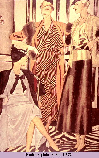
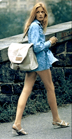
However, unity also exists in variety. It is not necessary for all of the elements to be identical in form providing they have a common quality of meaning or style. For example, fashions from a specific period share common features of silhouette, materials, and color that identify the style of the day, or the look of a particular designer.
Unity can also be a matter of concept. The elements and principles can be selected to support the intended function of the designed object; the purpose of the object unifies the design.
No comments:
Post a Comment